At the Security and Design Workshop, we realized that our original plan of book-ending a classic digital security training with human centered design exercises was not ideal – many elements of learning and exploration that are key to training are similarly core to collaborative design.
To test this out, we spent one afternoon running a digital security training on mobile security. We based the training on the ADIDS adult-learning approach, and used a selection of Level Up curricula components, integrating human-centered design components into the flow of the training. The rest of this post will run through the components of the training and the outcomes from it.
The ADIDS model uses a mix of engagements to help adult participants learn a specific topic, starting with an opening Activity that introduces the topic in an engaging fashion, then Discussing the topic, then the lecture/training section (“Input”), followed by a hands-on “Deepening” - often installing and using a specific tool, and closing with a Synthesis that summarizes the entire topic and answers remaining questions. (Learn more about ADIDS at LevelUp).
For the beginning Activity, we used We are the Internet (adapting it for mobile communications) by adding in participants (wearing tin-foil hats) as the cell towers.
The Discussion and Input sessions came from the private mobile communications curricula set.
Adding extra letters to ADIDS - ADIDDS?
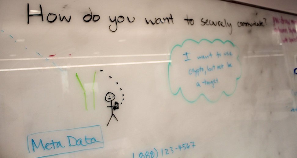
The training then shifted to a more human centered design process. Before jumping in to working with specific tools, we added a “Design” component – asking participants to provide the design elements they would want, as well as some participants were concerned about when making a secure mobile call.

By having already run through some design “warm-up” activities, the participants were able to throw out a collection of ideas for secure mobile communications relevant to our desires for easy communication and informed by the Activity, Discussion and Input sessions.
We then moved into the deepening component, with hands-on installation and practice using the Signal app. Signal is well-regarded as an amazingly usable app which provides high-end security without a confusing interface – so it was a bit of a surprise when we discovered that there were still other improvement suggestions from the participants (in many cases due to the differing application security frameworks across iOS and Android). This underlined that even the “best in class” digital security tools can benefit from this process.
(The issues we wrestled with, mainly around confusion with the different, but very small lock icons in the Android version, are already present in the Signal issue queue in various forms - Inadvertently sent insecure messages via SMS without clear notification and 3 different padlock icons plus a mild confusion around the fact that the lock is absent in Signal on iOS, as Signal does not take over default messaging in the way it can on Android)


